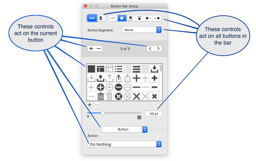
Button bars were introduced to FileMaker in 2015 with version 14 and they quickly became a favourite tool for managing many different layout and display jobs. The ability to display an SVG or PNG image beside a text label and link it to a script action made a mundane and laborious job easy and satisfying. The only problem is that some aspects of the button bar affect all elements. We can control the appearance of the button and respond to state behaviour for active, inactive, focus, and hover but we cannot apply these differently to individual buttons on the bar.
What is the Problem?
Button bars are multiple buttons, capable of displaying images and dynamic text strings, that all share the same style. This allows us to make a single change and see it reflected in the entire button bar. (Even better, to make a single change to the Theme and see it reflected in every button bar in the file – but that is a different topic). And that is the problem – one size fits all – is not a perfect fit for every occasion.
The button bar allows us to display text, icons, or both icons and text. When you make that choice it is made for every button in that button bar. You cannot choose a different option for each icon. Also, the icon size is set for all icons in the bar, it cannot be set for each button.


The button bar allows us to display text, icons, or both icons and text. When you make that choice it is made for every button in that button bar. You cannot choose a different option for each icon. Also, the icon size is set for all icons in the bar, it cannot be set for each button.


The other issue is that the CSS controls that are applied in the Appearance inspector panel are applied to the button bar as a whole. We cannot apply appearance settings to individual buttons within the button bar.
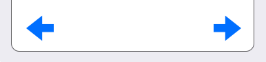
The defaults are centre aligned for vertical and horizontal spacing.
In general, these things are positives. It makes it very easy to build visually consistent objects for the layout. Occasionally we want to stretch the envelope and these rules get in the way.
Controlling the Display of Icons in Button Bars
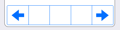
We’ll use a pair of back / forward buttons to illustrate the most common issues that we bump into with button bar displays. In the image below we have a pair of buttons, one with the border turned on so that we can easily see the spacing and centering. The other with the border turned off.


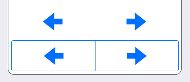
Taken by itself this result is good. But given some extra constraints that we have to meet, it may not be adequate. What if we want the button to be as wide as the screen and we want the arrows to sit close to the left and right hand edges? How do we achieve the result below?


Stretching the button to make it wider is the first option. However our buttons are centre aligned. As we make the button wider, the buttons move further away from the left and right borders. In the image below you can see the outcome. It’s functional, but not what we wanted.


Solution One: Defer the Problem
One solution is to use two separate buttons. Size them and place them exactly where you want them. You might say, Done and done!
The first drawback with this option is that people often ignore the amount of effort involved in getting two objects to be the same size, aligned, consistent with the other objects, obeying the same set of rules, and so on. If you really have done everything to one object, have you done everything to the other object?
Let’s assume you have developed the perfect theme where nothing needs to be done to “on layout objects.” You will still need to ensure that objects have “on layout” stye properties applied to them. Object anchoring is layout level control that supersedes Themes. If you have two buttons, they will have to have different object anchoring rules.
That seems like a small thing until you copy one of the buttons and use it to replicate both buttons. The “on layout” styling differences will be preserved (which we want to happen 99% of the time) and you will have to change them. This seems trivial until you have to change “a lot” of them. The definition of “a lot” is different for all of us but at that point in time you will wish that cut and paste was the only task you needed to do.
The next drawback is that nothing ever stays the same. Some time in the future you will want to modify the buttons. Perhaps you’ll duplicate it and remodel it or you need to change things. When that happens, and you enter Layout Mode, you will have more objects to manage and more work to do. If that person is not going to be you, TLDR;
Conscientious developers and code maintainers: read on
If we are able to retain the buttons on a single button bar we will reduce the amount of time we spend maintaining this system. In any application that we create, the ideal amount of maintenance time is zero. We can all roll around laughing now but the closer we get to that ideal the better. The goal, for us as developers, is to make the future easier. Spend a minute now to avoid hours of work in the future.
Introducing the Shim
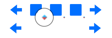
Our solution is to add some extra buttons that will function as shims, filling the space between the two arrows and forcing them out to the edges. Adding several shims puts the arrows into the right location, though we have a new problem to deal with.
Adding shims is fast, easy, and it allows us to retain the utility of the button bar so we see it as a win win solution. Except for the visual baggage! The default icon is a square with rounded corners – yikes – 😧
Our Solution
When we first thought of this solution we imagined that a shim could easily be replaced, in the future, by a functional button. That never really happened. Sometimes it happened.
The real advantage of using shims, that we have seen, is that it utilises a core behaviour. Our assumption is that it will be supported for years to come.
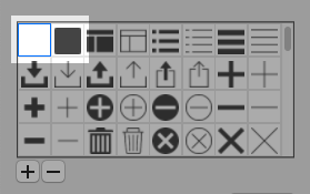
Our solution is to insert a blank or empty icon into the icon library where it is available for use whenever we want to use it.


The result after applying a blank icon to the shims is that the arrows are sitting in the position that we want them and we have them on a single button bar.


SVG to the Rescue
We use an SVG image to create the blank icon. The complete SVG is provided in the code block below. We’re providing it as text because it’s possible for SVG to harbour extra code and that worries people. Copying and pasting the text below and saving as “blank.svg” is probably faster than downloading.
The secret in our SVG is simply to provide an empty path. Look at the highlighted path. It does nothing but declare itself then close itself.
<?xml version="1.0" encoding="utf-8"?>
<svg version="1.2" xmlns="http://www.w3.org/2000/svg" xmlns:xlink="http://www.w3.org/1999/xlink"
	 x="0px" y="0px" width="24px" height="24px" viewBox="0 0 24 24">
<path />
</svg>
Alternatives to SVG
It is possible to use Conditional Formatting to selectively hide icons. You set a conditional formatting calculation of “1” or True and use the Icon Color control to set the icon colour to transparent. The image below combines two views of the same button. At the top, in Layout mode, the conditional formatting icons are visible. At the bottom, in Browse mode, the conditional formatting rule hides the display of the icon.


This method is effective. The reason we don’t use it are that there are a number of extra steps to apply the conditional formatting. Selecting the blank icon in the icon library is easier and faster and it is done in the same place as all the other button controls.
There may be some extra overhead for the conditional formatting calculation. Although the overhead must be negligible, it has to be performed for each segment and it must be done dynamically each time the layout is drawn. No matter how small that overhead may be, it is unneeded and avoidable.